
Responsive Web Design Services

Your website should look clean and work smoothly on every screen. We create responsive web design that adapts across mobiles, tablets, laptops and desktops so visitors can read, click and enquire without layout issues.

Mobile-friendly website design, adaptive layouts and cross-device user experience.


    Mobile-Friendly Websites That Work Across Every Device

    A responsive website helps users browse comfortably whether they arrive from Google search, social media, ads or direct links.

    We plan responsive UI design with readable sections, tap-friendly buttons, optimized images and clear enquiry paths.
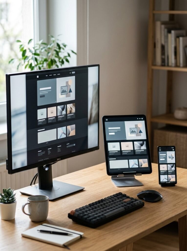
    Mobile responsive design

    Cross-device web design

    Adaptive layout planning

    Responsive UI design

    Mobile website design

    Tablet layout review

    CTA placement testing

    Speed-conscious structure

    Why Non-Responsive Websites Lose Visitors

    A Website Can Look Good on Desktop and Still Fail on Mobile

    If sections break, buttons become hard to tap or text is difficult to read on mobile, visitors leave before they contact your business.

    Broken Mobile Layouts

    Images, headings or forms can overlap when the design is not planned for small screens.

    Hard-to-Tap Buttons

    Small buttons and crowded sections make mobile users avoid taking action.

    Slow Mobile Experience

    Heavy visuals and unoptimized layouts can reduce engagement on phones.

    Inconsistent Device View

    A website may look different across browsers, tablets and screen sizes.

    Our Responsive Design Approach

    We Design for Mobile, Desktop and Every Key Screen Size

    Responsive design is not only resizing sections. It is planning how users read, scroll and act across devices.

    Plan Flexible Layouts

    We structure sections so content adapts cleanly across screen sizes.

    Optimize Mobile Readability

    We adjust spacing, font sizes, images and CTAs for mobile users.

    Review Key Breakpoints

    We check how important pages behave on mobile, tablet and desktop views.

    Improve Action Flow

    We keep enquiry buttons, forms and contact details easy to access.

    Strategy

    Responsive Layouts, Clear CTAs and Cross-Device Testing

    Responsive websites perform better when every section is planned for real user behavior.

    We focus on device-friendly layouts, content hierarchy and conversion paths.

    Review audience devices

    Plan mobile-first sections

    Design responsive layouts

    Optimize fonts and spacing

    Check CTA visibility

    Test tablet and desktop views

    Improve image behavior

    Finalize cross-device experience

    Who We Are

    Responsive Website Development for Growing Businesses

    10+

    Years of Digital Experience

    Surya Digital Solutions helps businesses build mobile-friendly websites with responsive UI design, adaptive layouts and cross-device experience planning. Our Responsive Web Design Services support businesses in Hyderabad, Andhra Pradesh and Rajahmundry.

    Businesses That Need Mobile Responsive Design

    Responsive design is useful for any business that receives website traffic from search, social media, ads or WhatsApp links.

    Healthcare & Clinics

    Create trust-focused websites for clinics, doctors, hospitals and healthcare service providers with clear appointment paths.

    Real Estate

    Show projects, amenities, locations, enquiry forms and site visit CTAs through professional property websites.

    Education

    Build admission-focused websites for schools, colleges, coaching centers and training institutes with course pages and enquiry flow.

    Retail Stores

    Promote products, store details, offers and local customer actions through fast, mobile-friendly business websites.

    Restaurants & Cafes

    Show menus, location, ordering options, offers and customer trust signals through clean food business websites.

    Salons & Beauty Brands

    Promote services, packages, transformations, booking CTAs and location details through premium salon websites.

    Ecommerce

    Build product-led online stores with category pages, checkout flow, offers and customer trust elements.

    B2B Services

    Explain services, case studies, expertise, contact forms and lead generation paths for professional service businesses.

    Give Every Visitor a Smooth Website Experience

    If your website is difficult to use on mobile, responsive web design can improve readability, trust and enquiry actions.

    FAQs

    Responsive Web Design Questions About Mobile-Friendly Websites

    Find clear answers about Responsive Web Design Services, planning, development, design and website performance.

    They involve designing websites that adapt to mobile, tablet, laptop and desktop screen sizes.

    Most visitors use phones, so a mobile-friendly website improves readability, trust and enquiry flow.

    It means planning the website experience across different devices and screen sizes.

    Yes. Existing layouts can be reviewed and improved for mobile and tablet users.

    A better mobile experience can support user experience and SEO performance.

    Yes. Key breakpoints can be reviewed during design and development.

    Adaptive design adjusts layout behavior based on device size and viewing context.

    Share your current website or page requirement and target audience.